Study on the Usability of Semiotics in Graphic Design
Keywords: Fine, flat, graphic design, semiotics, usability studies.
Abstract. Currently, The current flat design has become a mainstream approach is widely used in web design, computer and mobile phone systems, interface design. In graphic design, graphic symbol design is increasingly being taken seriously and use minimalist design symbols often appear in print design plane, PPT presentations, public areas, identity-oriented system like. This paper discusses the design of graphical symbols flat in graphic design use need to make the audience cognitive ability, graphic symbols standardized principles, design principles angles for effective information design to achieve efficient information communication. Materialized mostly graphic image symbols, and mostly flat graphic indicator; flat screen symbol by the proposed development materialized symbol interface evolved. Materialized the graphical interface and the graphical interface is flat coexist and cannot replace each other. During the design, the designer should be based on the advantages and disadvantages of the two styles complement each other interfaces, common graphical interface design services.
Introduction
Today, the mobile Internet as an important sign towards the information society, information resources to meet the people of the richness, diversity and access mode flexibility, convenience and mobility needs. The emergence of mobile terminal makes access to information even more ways to enhance an absolutely important position, but also because of this, people on the phone’s features, quality and other requirements are also increasing.
The main task of graphic design is to strengthen the exchange of information between people, is the performance of graphical symbols tool exchange required. The current flat design has become a mainstream approach is widely used in web design, computer and phone system interface, PPT, flat-screen print and in public areas such as identity-oriented system design. Simple graphical symbol accompanied by a short text message to pass different meaning, purpose is to allow people to quickly clear awareness and understanding. Graphic design appropriate symbol not only bring visual beauty, but also to replace the cumbersome expressed in words, to convey information at a glance.
In recent years, flat style swept the field of digital interface, the smart phone in its interface design is also increasingly used to this style, as a smart phone interface main elements, carries the flattened icon indicating the function information important role in transmission, its operating efficiency has been much attention to design practitioners and the research community. Currently on academic research among flat design, the icon for the study of usability problems are more scarce, the vast majority of existing research dedicated to qualitative theoretical analysis, the lack of objective quantitative research as a reference, and thus the actual availability of flat icons lack of a clear conclusion and in this study, for the first time physiological data with a combination of psychological data on the availability of flat icons depth study.
As a smart phone user interface in an integral part of the design of the phone icon in the experience economy driven began to play an increasingly important role, it carries with it the expression of specific functions and the important role of transmitting information. At the same time, the merits of icon design will directly affect the user experience and operational efficiency user interface design has become an important factor affecting the success or failure. Current research work related to academia flat design which is ongoing, this article from the perspective of design elements, the existing theoretical research supplement; At the same time, the existing research on the flat design and design of the actual use of materialized efficiency is no clear discussion of the results, a lot of literature has pointed flat icon simple, efficient features in the study, but the lack of evidence of objective evidence, so we are starting from a usability point of view, as experiments on flat icons materialized icon comparative study, you can search for two types of icons efficiency more in-depth discussion, in order to provide an objective reference for the relevant academic research.
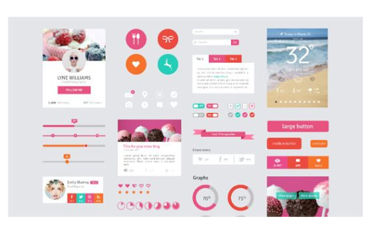
Figure.1 Flat design
The Proposed Methodology
User interface virtualization. With the rapid spread of smart mobile phones alternative to traditional phone and touch-screen technology, mobile phone interface, any original physical button has been gradually transformed into the software interface of the virtual keys. In the pursuit of handset design and integrated accounting wave, many Android phones also have physical buttons below the screen’s only designed to become a key form of induction, a trend that makes the most of the smart phone in addition to home and on key volume, lock screen button, there’s no extra physical keys, the operation of mobile phone users by the majority of the screen is completed, and thus gradually evolved detail gesture commands.
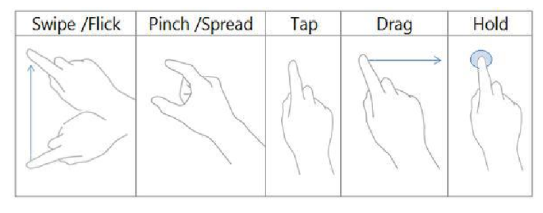
Figure.1 Schematic diagram of operating gestures
flat design.Flat first refers to the modern enterprise management process, in response to the plight of the traditional hierarchical organizational structure faced adopted a management model. The core of the model is to reduce the layers of management and appropriate management of all levels of management to increase the amplitude, and eventually will be similar to the pyramid form of organization into a more flattened form to improve management efficiency. From a social development perspective, the idea of ​​easing the situation well in all areas due to the rapid economic development brought about by organizational level redundancy, and therefore outside the field of business management, this concept also has good application value.
As a new, more and more designers and design style used by the organization, not simply flat design with innovative visual style to win users eye, but through the extra ingredient abandoned in the design and the decorative elements of restraint, giving users a better experience. In the new digital era background, flat design choose a more suitable for the characteristics of the virtual interface design approach, rather than a continuation of the traditional design style, it is precisely because it has brought the rapid development of flat design in recent years.
Materialized design.From the visual style, the materialized with the flat in stark contrast to the former by giving audiences do addition way, the use of shadows, highlights and a gradient effect on image icon to maximize close to the real object, with vivid three-dimensional effect to use bring a strong visual impact; while the latter is in the form of subtraction, to remove redundant decorative elements, and then extract the main part of the article, and present them in the form of simple graphs.
Although the two images using a different design approach (the former and the latter is a flat style quasi-physical style), but both are based on the reality of the alarm image as a template to make too, that the only difference between them in the right sense of reality on more detailed characterization, but nature does not jump out of the old framework to create new timekeeping, this time with a flat quasi-physical difference can be understood as a decorative technique on. Thus, in the course of the study must be combined with the use of a specific object context in order to make a correct understanding of the two design styles.

Figure.1 Flat and materialized style icons
Flat icons in visual form.From the perspective of the visual form of icons, smart phone interface icons can be distinguished from the two dimensions of time and space. From the time dimension, the phone icon can be divided into static and dynamic state. Which as the name suggests is a static icon icon elements remain static icon, the class icon is currently widely used in mobile phones user interface which. And dynamic visual style icon over time is changing, distracting when used in smaller interface, and thus rarely appear among the mobile phone interface.
From the spatial dimension, the phone icon can be divided into two-dimensional, three-dimensional and three-dimensional space of three forms. Wherein the two-dimensional icon with the latter two diametrically opposed in style, it avoids the shadows, highlights, and other three-dimensional simulation of the effect of the material in the design process, resulting in the visual style it showed a strong tendency to flatten. Further subdivided on the basis of the two-dimensional handset icons can also be divided into simple monochrome icon and complex multi-color icons.
Body element.Flat icons in the main element is the means to play a major role in the transmission of information in the icon section.
Size icons. Due to differences in the smart phone hardware specifications and product positioning on, resulting in the current characteristics of the phone screen size diversity, and to interface design workers brought unprecedented challenges. At the same time, the size of the icon has become a matter of design choice requires workers often face.
Flat internal icon generated.Products due to human practical needs to be created, early product form most simple and plain, after the Arts and Crafts Movement after the product’s components have been decorated to a new height, in the subsequent internationalism movement, designers again return to reason, he began to pursue the simple and efficient design form. From the design evolution trend is easy to see: With the development of society, design forms are also experiencing an iterative development process from simple to complex and then to mobile phone interface icons materialized birth, it helps people reduce cognitive burden and narrow the distance between the display unit to assume an important role, but with the widespread adoption of smart phones, this role is already overtaken by events. In this case the public needs to be more simple, modern, and can be accommodated in the limited screen design in the form of additional information, in such a social environment flat style icons have emerged, and quickly swept through the design.
It is the image of the symbol of traditional design approach materialized icons used, namely by imitating real objects textures, shadows, and other effects of gradual way to shorten the distance between the user interface and product awareness to reduce costs. But in recent years with the rapid development of diverse Internet products and mobile phone functions, making the product interface is also more and more filled with information, because the flattened icons using more indicators and symbols, therefore its use in the mobile phone interface which also makes the smaller screen to hold more information, to achieve the maximum interface features.
Flat external design generates.The arrival of web2.0 era, breaking the room Internet information barriers between each other, so that the user between the site and realize the two-way exchange of information. With the rapid proliferation of computers, many Internet users to be in the bottom-media background to create vast amounts of information resources, and gradually cause the current information explosion situation. As the Internet and smart phone product interface is filled with more and more information on the loose interface classify and organize the content becomes very important at the striking simplicity of flat icons used to distinguish between different content identification function on It is particularly efficient. To visualize the icons instead of boring text, not only shrink the layout, improve the rate of plate interface, but also convenient for users to search.
With the upgrading of digital products continues to accelerate, the mobile phone market have been the birth of many different sizes and resolution display, which gives materialized from the shadows of the past, icons, textures, gradients, and other three-dimensional effect constitutes brought new challenges diversity phone screen enables designers need to create a variety of sizes and resolutions icons to adapt to this trend, which makes materialized icon design becomes both cumbersome and time-consuming, not only increases the workload of the designer, but also improve the development costs. The flat design uses icons to detail the elements more restrained and more use of vector graphic design elements and symbols, can solve the problem of adaptation at different resolutions.
Flattened icons designed to minimalism as the core, advocated the adoption of a simplified rendering of images to reduce the complexity of a graphical interface, while the use of bright colors to improve the clarity of the interface layout, enables the user to focus more on desired completed tasks. Therefore, the above analysis shows that, flat style icons can help users better perform tasks more functional interface, especially in the smaller screen smart phone interface which, it can well improve recognizable icon element , efficient and user-friendly operating in different environments.
Conclusion
We analyzed the availability of flat icons. First, we analyzed the characteristics of smart phones and equipment operation, carded product usability evaluation system, eye tracking technology related indicators. We introduced the flat design concept, and through existing mobile phone brands and APP interface icons investigation and analysis summarizes the status of the application icon flat, visual form, color and size body element, and generating flat icon analysis of the causes. In the latter part of the article, in conjunction former interim research results, based on the collection and self-painted the corresponding flat icon creative design eye search experiment, and post-test questionnaire and subjects interviews of flat icons availability of comprehensive evaluation. Most smart phone interface design will be used simultaneously to two types of flat icons, such a design approach not only ensures improved aesthetics user interface operational efficiency, but also to some extent, it is possible to attract the user’s . With the social environment and the changing needs of users, smart phone interface design has been in development and change them, from the original materialized style to today’s prevailing flat style appearance of the style icon of the phone has undergone tremendous change, to among the mobile phone interface usability studies icons flat, one can explore the actual efficiency of the icon, subjective feelings and understanding of user satisfaction rating in the course of the icons, it also can be the basis of empirical research on future icon design work to provide a reference and reference.
Reference
1. Lupton, Ellen, and Jennifer Cole Phillips. Graphic Design: The New Basics: Revised and Expanded. Chronicle Books, 2015.
2. Calori, Chris, and David Vanden-Eynden. Signage and wayfinding design: a complete guide to creating environmental graphic design systems. John Wiley & Sons, 2015.
3. Krasner, Jon. Motion graphic design: applied history and aesthetics. Taylor & Francis, 2013.
4. Ly, Tiffanie. “CST 300L October 7, 2013 The Growth of Graphic Design and the Designer Graphic design is an art medium that communicates through combining specific elements to create the representation of a certain product or project. This art form is unknowingly.” Growth (2013).
5. Wang, Qi, and Huifang Li. “Analysis on Tactile Field in Current Graphic Vision Design.” 3rd International Conference on Science and Social Research (ICSSR 2014). Atlantis Press, 2014.