Comparison and Analysis of Customer Service Message

Customer service Message:
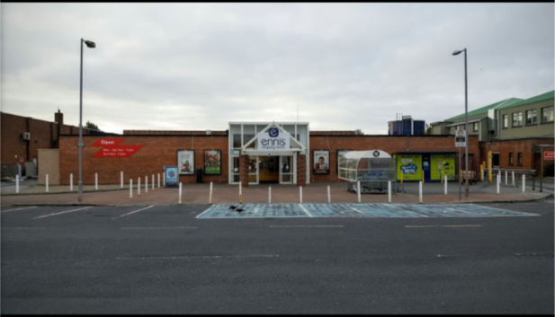
Negative: The outside of the store looks very un-kept. The pillars lining the parameter are rusted and worn. The disabled parking spaces are dirty and the paint has worn away. There is a significant smell that comes from the bins at the right hand side of the building in the picture. The windows that make up the entrance are grimy and the white panes have a yellow hue from not being cleaned regularly.
Recommendation: I would recommend that they replace the pillars that surround the parameter entirely with new ones. Some of them are even crooked as you can see from the photo. I would suggest repainting the disabled parking spaces and I would suggest cleaning the windows more regularly than they do. I would also move the bins further down the alley to try and avoid the smell.
Â
Dunnes

Customer Service Message
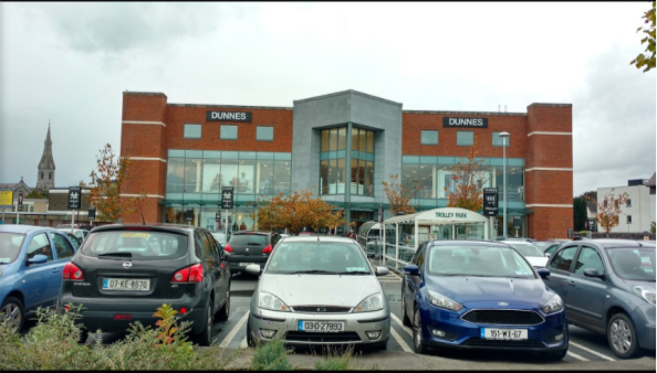
Positive: The initial impression that you get of this store from looking at its exterior is that is looks well kept, professional and tidy. The trolley bays are neatly and safely positioned so as not to disrupt traffic and even the shrubbery planted around the car park is a nice touch. The store looks very big and grand from the outside and the windows are nice and large showing that the store looks tidy and that they have nothing to hide.
Â

Customer Service Message
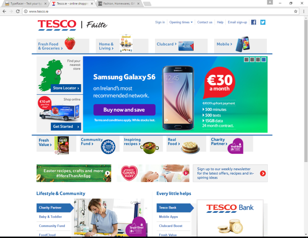
Negative: Although everything here is clearly labelled I would say that the overall look of the page is a bit clustered. I feel like there is too much going on for your eyes to settle immediately on what you want. The colours are quite bright as well and although that helps to highlight all of the options and services I feel it can all be a bit distracting. There is also no search bar if you want to look for something specific.
Recommendations: I would recommend spacing everything out a bit more and tone down the colour content just a little. I would also suggest a search bar to save customers having to look for something specific through all of the different categories.
Â

Customer Service Message
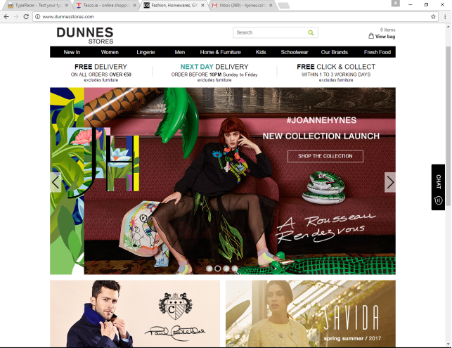
Positive: I feel this website is more spaced out, everything seems to be more clearly visible and the neutral tones don’t distract you from what it is exactly that you’re trying to look for. It also has a search bar for specific searches. There is even a bubble to the right that allows you to chat directly to a member of staff for help or support.
Recommendation: The only recommendation that I could think to give them is to make “Fresh Foods” a slightly bigger option as most people know Dunnes Stores as a grocery store.
Customer Service Message
Negative: The idea of the Tesco Clubcard is a very good one, however much like the Tesco website, I feel like there is a lot going on in the leaflet. Once again, it is jam packed with bright colours and buzzwords and it’s all a little distracting to read. Your eyes keep jumping to something new and I feel like you don’t properly digest the information that you’re being given, even though it is all there.
There is an “optional information” section on the application form which asks you personal questions like the ages of everyone else that is in your household or your dietary requirements. It is an option to fill it in and they say that it is because they want to send you appropriate offers but the fact that they asked may deter certain people that value every aspect of their privacy.
Recommendations: I would tone down the content in the brochure and the bright colours to make it easier for people to read the important information that they need to know. For example, you are given a temporary card that you cut out to use before getting the real one and it is written in very small letters on the inside that you can use it immediately. It’s important information that your eye does not immediately read.
(See Attached)
Customer Service Message
Positive: This is a brochure offering healthy meal recipes based on the television show “Operation Transformation”.
I think this is a good idea because it shows that it is easy to eat healthily at affordable prices. It is well laid out starting with a list of ingredients that you would need to buy for the week which could make all of the meals in the brochure. They even divide them into vegetables, dairy, meat etc. to make it easier for the customer to know exactly what to get. It then goes on to give you the specific recipes.
Not only that but it shows you the deals that are currently available on some healthy foods and gives you a voucher for €10 in any Dunnes Store.
It’s a great idea because it promotes healthy eating and shows that it won’t break the bank.
Â
Customer Service Message
Negative: Clearly, this article would imply that Tesco Ireland are not doing well financially. Not only that, but it shows that Tesco has no loyalty to staff that have dedicated over 20 years of their life to them. It portrays to the consumer that Tesco are just looking to make money and would deter the consumer from shopping there on personal morals rather than what the store has to offer. It’s bad press for the store and it shows poor leadership skills if they felt this was the best way for them to earn more money.
Recommendations: If Tesco want to keep many of their loyal customers, I would recommend them reconsidering their pay cuts policy as it could perturb a number of people.
Â
Customer Service Message
Positive: This article shows that Dunnes Stores are open to communication with their staff and want them to be happy just as much as they want to earn money. It also shows that the staff stuck together and got what they were fighting for, for Dunnes Stores workers all over the country, not just for themselves.