Compositional Analysis of Images
DRAWING ON KRESS AND VAN LEEUWEN’S CONCEPTS OF THE GIVEN AND THE NEW IN READING IMAGES: THE GRAMMAR OF VISUAL DESIGN (1996), PERFORM A COMPOÂSITIONAL ANALYSIS OF ANY TWO OF THE GIVEN IMAGES.
An Image is a tangible or visual representation of a person, a place or a thing. All images carry a meaning which can be understood differently by different people in different situations. Composition is the way in which something is put together or arranged or the combination of parts or elements that make up something. Malcolm Barnard in Approaches to Understanding Visual Culture (2001) suggests that we concentrate on the looking and analysis of images by focusing on “elements of visual culture that are said to be ‘intrinsic’ or ‘internal’ to the work; elements such as shape, line, colour, texture, and layout or composition”. (Barnard, 2001, p.168). An image can be analysed through it’s composition and drawing on Kress and Van Leeuwen’s concepts of the Given and the New a compositional analysis of two images will be performed in this essay.
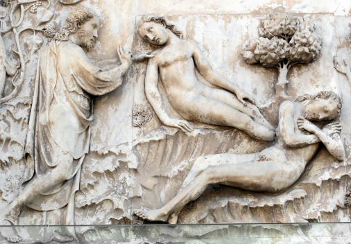
Kress and Leeuwen argue that the left of an image is assumed to be ‘The Given’ and the right to be ‘The New’ meaning that the left is something which is already known and the right is the key information which is not yet known or agreed upon and thus creating the salience. Speaking of salience, before we analyse the images it is important to know the three principles of composition.
- INFORMATION VALUE: The value of an element depends on it’s placement as different zones of an image have different values attached to it.
- SALIENCE: The most eye catching element of the image can be realized by factors as placement, size, contrast, colour, sharpness, etc.
- FRAMING: The dividing lines created by elements or actual frame lines disconnect or connect elements of the image representing if they belong or not to one another. (Kress and Leeuwen, 1996, p.177).
They argue that this theory can also be applied to magazines, newspapers, advertisements and diagrams. Magazines and newspapers tend to have pictures and articles on a left/right axis. The structure of sentences also work with the theory. Other theorists like Ron Needham and Freud had diverse views of the ‘Left’ and ‘Right’ of an image with left being bad and right being good and left being sinful and right being righteous respectively.
When analysing the below image of ‘The Creation of Eve by Lorenzo Maitani’ we see that God is placed on the left who was there already and is thus considered as Given while the woman Eve the new creation is on the right regarded as the New. The placement of Eve in the image is not exactly in the right one can argue as majority of her body is placed in the centre of the image. Michelangelo, on the other hand, in his famous painting The Creation of Adam on the ceiling of the Sistine Chapel, placed God on the right. (Kress and Leeuwen, 1996, p.181). The theory did not hold much weight as now it was man who was the Given and God as the New. Furthermore, considering the diverse views God being on the left makes him bad and sinful with man being good and righteous


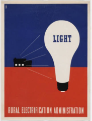
The above image by Lester Beall – Rural Electric Programme 1937 can also be analysed as the Given and the New by understanding that the house on the left is Given and the bulb on the right is New. The image is targeted at the rural or countryside location where light was not common at that period of time making the bulb which has the words ‘LIGHT’ printed on it something new which has never been there before, thus implying that the house can now have light, if you see the sentence structure (the house can now have light) Kress and Leeuwen’s theory seem to be working. But if one reversed the sides then the bulb will be the Given which is available to the house making the house New. The house will be regarded as new because it has got the light in it. The theory of Kress and Leeuwen did not live up to the expectations once more.
Every person looking at an image would have a different interpretation of the image depending on the time, culture, situation and environment, the concept cannot be taken as wrong or right as every viewer has his own ability of thinking and can portray any meaning of a given image according to his choice. Analysing images through a theory means analysing images through the same lens which will certainly take away the true meaning of the image. Kress and Leeuwen admitted that their theory does not work for every image which has been proved by analysing the above two images. Before concluding this essay your attention would be needed on the point that when making am image the maker has a message that he wants the people to know or draw attention to and if the viewer interprets it differently the viewer would not know if has got the right message which was intended unless and until he asks the maker or studies what the exact message was. Theories cannot be depended upon while interpreting images as every viewer has his own way of encoding messages, I would like to close with a quote (Stuart Hall, 1997, p.9):
“It is worth emphasising that there is no single or ‘correct’ answer to the question, ‘What does this image mean? or ‘What is this ad saying?’ Since there is no law which can guarantee that things will have ‘one, true meaning’, or that meanings won’t change over time, work in this area is bound to be interpretative – a debate between, not who is ‘right’ and who is ‘wrong’, but between equally plausible, though sometimes competing and contesting, meanings and interpretations.”!Â
Bibliography
Kress, G & Leeuwen, V (1996) Reading Images: The Grammar of Visual Design, Routledge.
Barnard, M (2001) Approaches to Understanding Visual Culture, Palgrave Macmillan.
Hall, S (1997) Representation: Cultural Representations and Signifying Practices, SAGE.