Graphic Enhancing Tools and Techniques
Task 10
D1 – Evaluate the tools and techniques used to enhance your original graphic.
I used the program “Illustrator” in the creation of my original Adventurer logo because it was a good software for creating simple shapes which allowed me to utilise the full functions of what it was able to do. I also picked the software because of the fact that it allows for many ways to align and move around pieces of shapes to make the perfect shape for the logo.
The software was mainly made to create simple shapes and merge them together to create a graphic, due to this it helped me create a logo which truly resembled something that would be for a big/famous gaming business or for a gaming company such as Adventurer.
When making this logo I had many constraints, such as the problem of the software not being very  user friendly. It was a lot of hard work trying to learn all the ins and outs of the software, not knowing anything about it. When trying to use the software for the first time everything was jumbled up and confusing, when trying to find a tool to do a certain function all I found was something that did the exact opposite and worse than other software that I had previously used.
The biggest limitation the software is the fact that its hard to make anything that isn’t a shape or cartoon logo, such as drawing actual shapes or creating “cartoony pictures” with specific premade lines. When using the software the program limited me in the way that allowed me to place a shape, however it did not allow you to cut or clear pieces of the shape to get a specific size of shape, making it a lot harder to make something to pixel perfection. One time I was able to create a perfect shield however, when trying to cut a small bit off I had to resort to placing an invisible white shape to cover up the piece of line that was not cut-able.
There were also limitations to what could be made, due to the game being a 15 age rated game, stopping me from going overboard with anything and trying to make it more friendly for the selected (15 and above) audience to also appreciate what we have created. I also had problems as we where limited to what software were preinstalled onto the computer to use, stopping us from using any other non preloaded software.
When co-operating with the client I had to make sure that I received user feedback and produced it to the client’s needs, by keeping to a corporate style, using file formats that are compatible with their software and keeping a way of allowing them to download and access the files for review at all times.
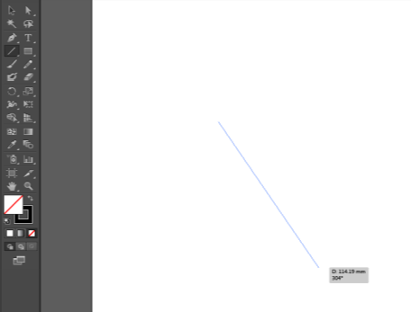
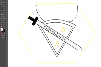
The software moulded the idea of using the line tool to shape out the base and structure of my shape, allowing for a freeform and complete way of editing and bending the line to my will. Due to the way the shape turned out which was being based on a shield and sword allowed me to fill the requirements of a family friendly logo that looked good and made sence on the leaflet I was designing.
I had to use techniques that enabled the graphic to be appropriate for inclusion in the leaflet, such as, having to make the leaflet extreamly clear and making it appeal to other people that were to see and look at the new games that are being devoloped. I tried to focus on making the logo being very detailed and rich with information about what the game would be by just looking at the logo itself, when looking at the logo you can see a sword and shield which is normally very common in Adventure or fighting games.
Because the logo is created for the company ‘Adventurer’ the copyright belongs to them, it is also because there is no use of other people’s content in the making and production of the logo.
 When creating the image I used three major tools, such as the line tool, which allowed me to create lines and edit them to make the shape into what looked like a shield. When doing this I was able to create more of a shape that was usable in making a completely new shape that was not supplied via the program.
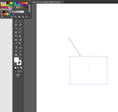
 The square shape tool allowed me to create a base around the Adventurer logo that eventully led to me being able to cut off unwanted pieces of line by turning the square invisible. When doing this I had the problem of it clipping or dipping other shapes but was able to fix it when it was being printed.
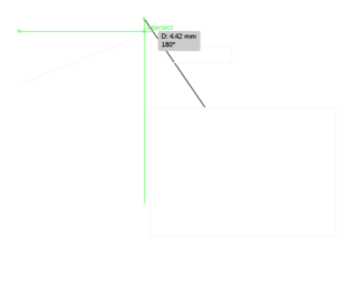
 The align function was also helpful, it allowed full free roam of placing and adding layers without much trouble. It helped with aligning different shapes to make it more of a collection of shapes rather then a mess of shapes in different positions. It also easily linked together two layers that needed to be pixel perfect.
All of these functions where very important to the creation of the logo, each having a different part and function when needing to piece together the shapes.
Enhanced Graphic Evaluation
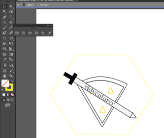
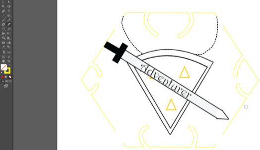
 I added a shape using the shape tool, then I have stretched out the square using the resize tool to cover the whole image, creating a sort of barrier. I have then changed the colour to yellow to match the triangles in the middle and rotated it using the rotating function so that they link together in a more colourful way and made sure any other layers remained in the background and away from the main layer.
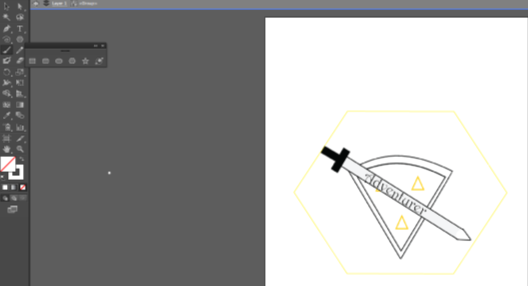
 In this image I have erased the tip of the sword using the ‘Paint Brush’ tool with the white colour to make the layers link together better, and by doing this I was able to make the blade look more shiny with the holster. I made sure to have the actual logo inside the box of the shape so it would not accidently overlap or overshadow any shapes already places onto it.
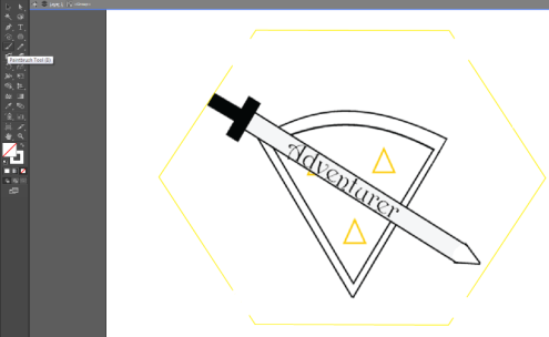
 In this step I changed the shape by deleting a section out of it using the ‘Paint Brush’ tool and selection of the white paint, this allows for a new kind of pattern that looks like a futureistic forcefield blocking any danger that may fall onto it. The white paint brush also immitates a kind of rubber that I can use to blend together a layer and shape. Within this I also planned it so that I was not accidently deleting anything else along with the already placed layers.


 I added two lines to the top that look like chains using the ‘Paint Brush’ tool and then changing the stroke type, this created a old map road path type of style or a chain from a neckless. I placed a two strokes down for each side making sure to line them up with yellow shape shield that I had placed from the last step making it line up almost perfectly with each side of the shape.
 For my final step I used the eraser tool and then made the outline change to a yellow paint, making it so that when I deleted something that had already been placed it would be removed and then the rubber would add outline from what it deleted which allowed for a pattern to emerge. After doing it to each side of the shape, I was able to delete some of the shield and then redraw it with the rubber making it look more unique then it did without it.
The file that I created ended up being a vector image because it was created and edited within a vector package “Illustrator” so that it would keep its quality and size while it gets resized. The finished logo was a PNG-24 and is 59.KB with the resoultion 595×842, while the Illustrator file was 1.19MB large.

