Models of Infectious Diseases
1.1 Introduction
As an aspiring doctor, I am always on the lookout for medical news and keeping up to date with the current affairs is something that has always interested me. Another thing which has sparked my attention over the recent years is the ability of mathematicians and scientists to model infectious disease, in order for the medical professionals to make decisions on how best to act.
For instance, prior to the 2016 Rio Olympic Games there was a lot of controversy due to competitors pulling out of their events because of the scare of contracting and spreading the Zika Virus. It is times like these that processes, such as modelling infectious disease, are so important; in order to understand whether an infectious disease will spread, how it will spread and what the dangers of the spread of the diseases are.
These models allow decisions to be made such as; whether the border control procedures need to change, whether there should be research into developing new drugs or whether they need to take further action and produce a vaccination.
The SIR model
One method of modelling infectious disease is through using the SIR model. This model starts from the premise that the whole population can be divided into three distinct classes; susceptible, infectious and recovered. ‘Susceptible’ refers to anybody that is currently healthy, but could potentially contract the disease. ‘Infectious’ refers to anybody that is carrying or suffering the disease, meaning that they could spread the disease to anybody that is susceptible. Finally, the ‘recovered’ class refers to anybody that is assumed to be immune to the disease; this could be naturally or through vaccination.
The SIR model is used in epidemiology in order to understand how the disease has evolved over time, and more importantly how it will evolve over time. It is therefore known as a dynamical system; because it tells us how state variables change over time. In this case, the state variables are the population of the three classes; ‘susceptible’, ‘infectious’ or ‘recovered’.
Notation to understand:
In order to model infectious disease, two parameters must be given:
a = the recovery rate
b = the infectious rate
The following notation represents the state variables:
St= the number of susceptible individuals at time t
It = the number of infective individuals at time t
Rt = the number of recovered individuals at time t
T = the time, in days
The changing state variables:
If St is the number of susceptible individuals at time t then…
 (1)
(1)
And…
 Â (2)
 (2)
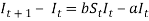
It can therefore be deduced that the change in the number of susceptible individuals is equal to the negative number of individuals that become infected in day t. The number is negative because in order for someone to become infected they move out of the susceptible state and therefore the population of susceptible individuals decreases.
 (3)
(3)
The change in the number of infective individuals is equal to the number of individuals that are infected in day t minus the number of individuals that recover in day t.
 (4)
(4)
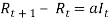
Thirdly, the change in the number of recovered individuals is equal to equation (2), the recovery rate multiplied by the number of infective individuals at time t.
 (5)
(5)
A theoretical example:
If we specify some values for the recovery rate and the rate of infection, we can begin to understand how individuals move between these classes over time.
Parameters for an infectious disease:
a = 0.05
b = 0.0001
Initial state variable values:
S0 = 10000
I0 = 1000
R0 = 0
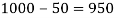
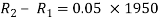
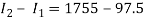
Applying equation (3) tells us the number of individuals that will become infected on day 1:


Therefore, from day 0 to day 1 the number of susceptible individuals will change to:

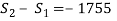
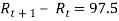
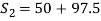
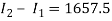
The change in the number of recovered people, given in equation (5) is as follows:
(5)


So the number of recovered people after day 1 will be:

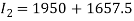
Finally, the number of infectious individuals will be:
(4)

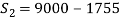
Therefore, we can see that from day 0 to day 1 the populations have changed to:
S1 = 9000
I1 = 1950
R1 = 50
If we repeat the process for the next 3 days, we can begin to see how the disease could spread over time:
Day 2:
(3)


(5)

(4)

Day 3:
(3)

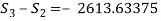


(5)


(4)


Table to show the populations after four days:
|
Day |
Number of susceptible individuals |
To the nearest whole number |
|
0 |
10000 |
10000 |
|
1 |
9000 |
9000 |
|
2 |
7245 |
7245 |
|
3 |
4631.36625 |
4631 |
|
Number of infectious individuals |
To the nearest whole number |
|
|
0 |
1000 |
1000 |
|
1 |
1950 |
1950 |
|
2 |
3607.5 |
3608 |
|
3 |
6040.75875 |
6041 |
|
Day |
Number of recovered individuals |
To the nearest whole number |
|
0 |
0 |
0 |
|
1 |
50 |
50 |
|
2 |
147.5 |
148 |
|
3 |
327.875 |
328 |
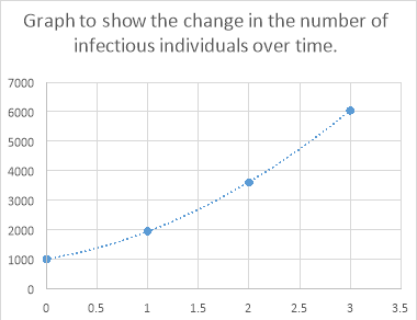
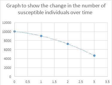 If we plot these on a graph against time we can see how this disease has spread through the population:

Continuing this process for the next fifteen days gives the following results:
|
Day: |
Number of susceptible people |
Number of infectious people |
Number of recovered people |
|
0 |
9000 |
1950 |
50 |
|
1 |
7245 |
3607.5 |
147.5 |
|
2 |
4631.36625 |
6040.75875 |
327.875 |
|
3 |
1833.66963 |
8536.417432 |
629.9129375 |
|
4 |
268.3726905 |
9674.8935 |
1056.733809 |
|
5 |
8.724970602 |
9450.796545 |
1540.478484 |
|
6 |
0.4791784 |
8986.50251 |
2013.018311 |
|
7 |
0.048564611 |
8537.607998 |
2462.343437 |
|
8 |
0.00710205 |
8110.769061 |
2889.223837 |
|
9 |
0.001341741 |
7705.236368 |
3294.76229 |
|
10 |
0.000307898 |
7319.975584 |
3680.024108 |
|
11 |
8.25174E-05 |
6953.97703 |
4046.022887 |
|
12 |
2.5135E-05 |
6606.278236 |
4393.721739 |
|
13 |
8.53011E-06 |
6275.964341 |
4724.035651 |
|
14 |
3.17665E-06 |
5962.166129 |
5037.833868 |
|
15 |
3.17665E-06 |
5962.166129 |
5037.833868 |
Rounding these numbers to the nearest whole numbers, and excluding negative numbers gives the following table:
|
Day: |
Number of susceptible people |
Number of infectious people |
Number of recovered people |
|
0 |
9000 |
1950 |
50 |
|
1 |
7245 |
3608 |
148 |
|
2 |
4631 |
6041 |
328 |
|
3 |
1834 |
8536 |
630 |
|
4 |
268 |
9675 |
1057 |
|
5 |
9 |
9451 |
1540 |
|
6 |
0 |
8987 |
2013 |
|
7 |
0 |
8538 |
2462 |
|
8 |
0 |
8111 |
2889 |
|
9 |
0 |
7705 |
3295 |
|
10 |
0 |
7320 |
3680 |
|
11 |
0 |
6954 |
4046 |
|
12 |
0 |
6606 |
4394 |
|
13 |
0 |
6276 |
4724 |
|
14 |
0 |
5962 |
5038 |
|
15 |
0 |
5962 |
5038 |

From the graph we can see that there is a point at which all of the groups level off. For example, by day 14 the recovered and infectious group level off, and be day 5 the susceptible group levels off at 0. The SIR model is therefore useful at this basic level in order to see how the three state variables interact with one another.
Using the SIR model for Ebola:
However, in order to model a disease such as Ebola, a few changes to the equations must be made. Two parameters must be introduced; the mortality rate and the duration of the disease.
The SIR model will be used to model the spread of Ebola in Guinea, according to the data provided by WHO, in 2014.
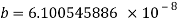
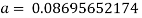
Calculating the rate of infection (b) and the rate of recovery (a) requires the mortality rate and the duration of the disease. The infection rate is equal to the mortality rate divided by the number of susceptible people. The recovery rate is equal to 1 divided by the duration of the disease.
In June 2014, there were 390 total cases of Ebola, 273 of these resulting in death. The duration of the disease is between 2 and 21 days. The duration of the disease used for the SIR model will be the midpoint; 11.5 days. The mortality rate of Ebola at this point was (273/390) 0.7. The population of susceptible people in Guinea in 2014 was 11,474,383
Therefore, the infection rate and recovery rate are as follows:


Bringing back the equations from before, the following values are going to be used, having rounded the recovery and infection rate to 1 significant figure.
a = 
S0 = (11474383 – 117) 11,474,266
I0 = (390 – 273) 117
R0 = 273
T0 = the start of June 2014
The following tables show the process of calculating the changes in populations:
|
a |
b |
s |
i |
r |
t |
|
0.1 |
0.00000006 |
11,474,266 |
117 |
273 |
0 |
|
0.1 |
0.00000006 |
80.54934732 |
68.84935 |
11.7 |
1 |
|
0.1 |
0.00000006 |
127.9481926 |
109.3633 |
18.58493 |
2 |
|
0.1 |
0.00000006 |
122.6893008 |
104.868 |
17.82126 |
3 |
|
0.1 |
0.00000006 |
147.484557 |
126.0614 |
21.42313 |
4 |
|
0.1 |
0.00000006 |
158.9781358 |
135.8852 |
23.09295 |
5 |
|
0.1 |
0.00000006 |
180.3286874 |
154.134 |
26.19466 |
6 |
|
0.1 |
0.00000006 |
199.6512232 |
170.6493 |
29.00192 |
7 |
|
0.1 |
0.00000006 |
223.579187 |
191.1009 |
32.47833 |
8 |
|
0.1 |
0.00000006 |
249.0221104 |
212.8471 |
36.17502 |
9 |
|
0.1 |
0.00000006 |
278.0642545 |
237.6695 |
40.39479 |
10 |
|
0.1 |
0.00000006 |
310.1130082 |
265.0614 |
45.05166 |
11 |
|
0.1 |
0.00000006 |
346.0453313 |
295.7723 |
50.27308 |
12 |
|
0.1 |
0.00000006 |
386.0276536 |
329.9443 |
56.08336 |
13 |
|
0.1 |
0.00000006 |
430.6727697 |
368.1011 |
62.57165 |
14 |
|
0.1 |
0.00000006 |
480.4377735 |
410.6332 |
69.80454 |
15 |
|
0.1 |
0.00000006 |
535.9504153 |
458.077 |
77.87343 |
16 |
|
0.1 |
0.00000006 |
597.8468096 |
510.9758 |
86.87102 |
17 |
|
0.1 |
0.00000006 |
666.8678465 |
569.9626 |
96.90528 |
18 |
|
0.1 |
0.00000006 |
743.8203017 |
635.7265 |
108.0938 |
19 |
|
0.1 |
0.00000006 |
829.610506 |
709.0416 |
120.5689 |
20 |
|
0.1 |
0.00000006 |
925.2410683 |
790.7643 |
134.4768 |
21 |
|
0.1 |
0.00000006 |
1031.828496 |
881.8479 |
149.9806 |
22 |
|
0.1 |
0.00000006 |
1150.611313 |
983.3501 |
167.2612 |
23 |
|
0.1 |
0.00000006 |
1282.964805 |
1096.445 |
186.5198 |
24 |
|
0.1 |
0.00000006 |
1430.413979 |
1222.434 |
207.9795 |
25 |
|
0.1 |
0.00000006 |
1594.649251 |
1362.761 |
231.8879 |
26 |
|
0.1 |
0.00000006 |
1777.54255 |
1519.023 |
258.5196 |
27 |
|
0.1 |
0.00000006 |
1981.165088 |
1692.987 |
288.1784 |
28 |
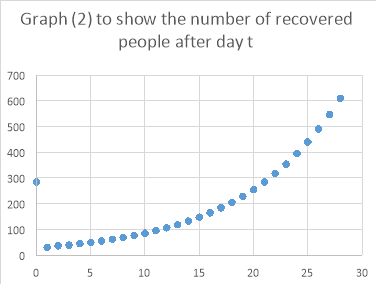
To the nearest whole number, the following table shows the number of people in each population over 28 days.
|
Day: |
Number of susceptible people after day t |
Number of infectious people after day t |
Number of recovered people after day t |
|
0 |
11474185 |
186 |
285 |
|
1 |
11474058 |
178 |
30 |
|
2 |
11473935 |
214 |
36 |
|
3 |
11473787 |
231 |
39 |
|
4 |
11473628 |
262 |
45 |
|
5 |
11473448 |
290 |
49 |
|
6 |
11473248 |
325 |
55 |
|
7 |
11473025 |
362 |
61 |
|
8 |
11472776 |
404 |
69 |
|
9 |
11472498 |
451 |
77 |
|
10 |
11472188 |
503 |
85 |
|
11 |
11471842 |
561 |
95 |
|
12 |
11471456 |
626 |
106 |
|
13 |
11471025 |
698 |
119 |
|
14 |
11470544 |
779 |
132 |
|
15 |
11470008 |
869 |
148 |
|
16 |
11469411 |
969 |
165 |
|
17 |
11468744 |
1081 |
184 |
|
18 |
11468000 |
1206 |
205 |
|
19 |
11467170 |
1345 |
229 |
|
20 |
11466245 |
1500 |
255 |
|
21 |
11465213 |
1673 |
284 |
|
22 |
11464063 |
1865 |
317 |
|
23 |
11462780 |
2080 |
354 |
|
24 |
11461349 |
2319 |
394 |
|
25 |
11459755 |
2585 |
440 |
|
26 |
11457977 |
2882 |
490 |
|
27 |
11455996 |
3212 |
547 |
|
28 |
11455996 |
1693 |
288 |
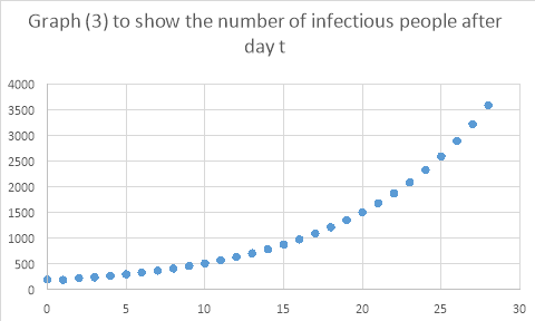
 Plotting these on graphs…

To calculate the equation of graph 1…
The graph appears to be exponential, so using the form y = Aekt , I will try to calculate the equation.
Taking days 3 and 24, I can solve the equation simultaneously.
11473787 = Ae3k
11461349 = Aekt
Ln (11473787) = ln A x 3k
Ln (11461349) = ln A x 24k


K = -0.000051648769
Substituting into the original equations to find A…
Ln (11433787) = ln A + 3k
Ln A = ln (11473787) – 3k
Ln A = 16.25568…
A = 11475064.9
So…
N (of susceptible) = 11475064.9e-0.000051648769t
Due to the massive range of numbers, the three series cannot be plotted on the same graph, and be of any use. Therefore, three separate graphs are necessary. The graphs show that with the parameters calculated for Ebola in 2014, the population of infectious people seems appears to be increasing exponentially, with no sign of a slowing rate. A similar pattern is shown in the recovered population, whilst the number of susceptible people is appearing to decrease exponentially.
The graphs over just 28 days did not show much, so the equations were used over a longer period of time. These graphs are shown below:
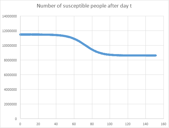
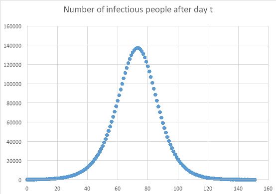
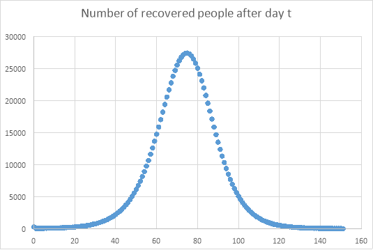
As expected, and shown in the previous graphs, the number of recovered and infected people increases rapidly over approximately the first 75 days, after which point the populations of both of these populations reduce in size. The number of susceptible people decreases after approximately 45 days, because more people have become infected or recovered. The number of susceptible people is important in predicting the way that the disease will spread, as the more susceptible people there are, along with a high infection rate, the more likely it is that another epidemic will occur.
The study of models of the Ebola virus are particularly important at the moment, as there are worries that the disease will spread in a different way, as it adapts to become airborne. Therefore, it is very important to look at how the disease has spread in the past, not just how it could spread in the future.
The graph below shows the number of cases of Ebola in Guinea, Liberia and Sierra Leone.
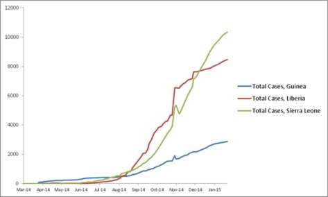
We can see therefore that the SIR model was not an accurate representation of the outbreak. If we compare the maximum number of cases in Guinea in May 2014, the value stays at a comparatively low level of around 200-300 cases. However, the maximum value for the same time, calculated by the SIR model was around, a much larger,10000 people. The graphs also look incredibly different. For instance, the graph generated by the SIR equations appeared to be a parabola, whereas the picture from CDC Stacks Health Publications did not resemble the same parabola.
This could be explained by several assumptions made prior to using the SIR model. For example, according to the SIR model, every individual has the same chance of contracting the disease. In the case of Ebola, however, in order to contract the disease, you must have direct contact with an infected individual’s body fluids, therefore, not everybody will have the same probability of contracting the virus. The values for the infection and recovery rate also cause huge variation if they are changed by only a small amount.
Bibliography:
https://www.youtube.com/watch?v=g0xRXDjXicA
https://www.youtube.com/watch?v=5y8ZJnsEBvU
https://www.youtube.com/watch?v=0k2cA8nYQiA
https://www.cdc.gov/vhf/ebola/outbreaks/2014-west-africa/
https://ibmathsresources.com/2014/05/17/modelling-infectious-diseases/
https://stacks.cdc.gov/view/cdc/27150
http://www.nhs.uk/Conditions/ebola-virus/Pages/Ebola-virus.aspx