Programming for BIG Data Project
Â
Nowadays, the amount of data generated and stored without an operation has exceeded a data analysis capability without the use of automated analysis techniques. The exponential growth of data is greater than it has ever been seen, extracting useful information from all the data generated and transform it into understandable and usable information is the challenge. There is where data mining assumes an important role, plenty of tools are available for data mining tasks using artificial intelligence, algorithms, machine learning and many others. In the present work two datasets were analysed, one with R and the other one Python. All the analysis was based in the CRISP-DM basic concepts: Business Understanding, Data Understanding, Data Preparation, Modelling, Evaluation and Deployment.
The full methodology was not applied in the project, but understanding parts of its process was fundamental, the steps are pretty straight forward and give a very good idea of every stage that data mining has to go through and the feedback brought from every stage.
The project scope is limited to identifying patterns in the data rather than predicting future, which could be examined as part of further study of the subject matter.
The present Project was divided into two different parts: Part 1: R Dataset Analysis and Part 2: Python Dataset Analysis. It contains also a brief contextualization about the Big Data Context and the importance of data mining.
We live in a time when the pursuit of knowledge is indispensable. Today, information assumes a growing importance, and a necessity for any sector of human activity, due to the many transformations we are witnessing. At every moment, we are facing new concepts and trends and we are amazed at how quickly they are occurring and affecting our lives, such as the technology that influences all sectors, social environments and touches every business and life on the planet.
The article written by Bernard Marr, and published by Forbes last year brings some statistics that convince that big data really needs attention:
– More data has been created in the past two year than in the entire history of human race;
– By 2020 around 1.7 megabytes of new information will be generated every second for every human being on the planet.
– Every second we create new data, a good example: only on Google 40.000 searches and queries are generated every second, which makes the huge amount of 1.2 trillion searches a year.
– Facebook users send on average 31.25 million messages and view 2.77 million videos every minute.
– Only in 2015, 1 trillion photos were taken and billions of them were shared on line.
– In 2015, over 1.4 billion smart phones were shipped, all capable of collecting different sorts of data and by 2020 the world will have over 6.1 billion smartphone users globally.
– Within five years there will be over 50 billion smart connected devices worldwide, all developed to collect, analyse and share data.
– Retailers that leverage the full power of big data would be able to increase their operating by as much as 60%.
– Now, only less than 0.5% of data is analysed.
All the Big Data generated, have some characteristics: Rapid increasing volume, variety, velocity and data storage and transfer, gathering and analysing it all became a huge challenge, but by using specific programs designed to analyse the information on algorithms based will overcome the challenges and the output can be used to enable the decision-making process.
For the R Project, a very specific database was analysed: “Tourists Visiting the South of Brazil”, The information was obtained in the Government website, in the Tourism division.
1.1 Business Understanding
Tourism is an important sector that has an impact on development of nation economy. For many countries, the tourism is the most important source of income and jobs generation. Brazil is the fifth biggest country in the world with 8,511,965 sq km of area and the nation is divided into 5 regions: North, Northeast, Central-West, Southeast and South Regions. The Best in Travel 2014, by Lonely Planet guide classified Brazil as the best tourist destination in 2014.
According to the official Brazilian Tourism Website Around 6 million people visit the country every year, it is considered the main touristic market in South America and the second in Latin America. It is estimated that only around 17% of all tourists visiting Brazil go to the South region, composed by three States: Parana, Rio Grande do Sul and Santa Catarina.
Having in mind those numbers and the knowledge that the most visited places in Brazil do not include the South of the country a dataset was analysed to get some information and find out how many visitors have been there and where they were from.
1.2 Data Understanding
Source data:
Format: csv, comma-separated
Size: 3.46MB
Number of rows: 73.392
Columns:
Â
1 Continent
2 Country
3 State
4 Year
5 Month
6 Count
Â
The technologies used were Excel and R Studio.
1.3 Data Preparation
The first downloaded version had 534.792 rows, it included the tourism information from all the 26 states and it was based on data from 1989 to 2015. It was a quite huge dataset that would not be convenient to extract useful outputs as Brazil had been through many economic and social changes in this period. Excel was used to exclude the information from other states as well as the years before 2005.
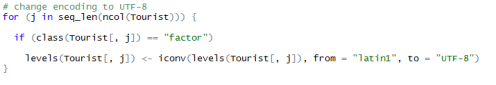
As the dataset was all provided in Portuguese Language the code was used to facilitate visualization:
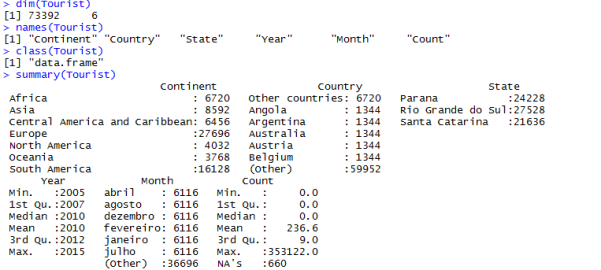
The next step was looking at the data, for a better understanding, Dimensions, Names, Classes and Summaries codes were written:
Results:
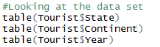
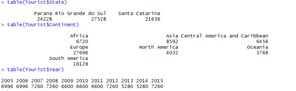
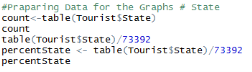
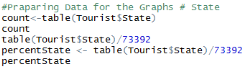
Some table codes were written to count each combination of factor levels:
Results:
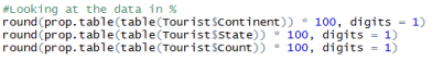
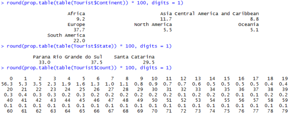
The code round was run to specify number of decimal places:
Results:
1.4 Modelling
A Linear Model was written to generate a better data visualization and analysis of variance:
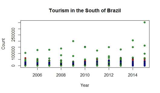
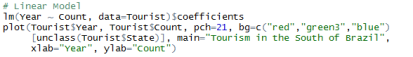
Some graphs were generated to have a better understanding about how many tourists visiting each of the states:

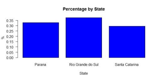
A Bar plot was generated for better visualisation:

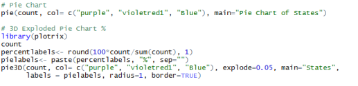
The same parameters were used to generate pie charts:
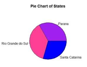
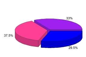
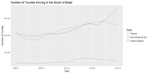
Parana with 33,01% and Santa Catarina with 29,48% have a very similar number of visitors and Rio Grande do Sul is the most visited place with 37,51%. With a little bit of research the percentage can be understood, as Rio Grande do Sul is the larger of the three states, having more options for the visitors and Some of the biggest manufacturing industries factories in the country are located in that area.
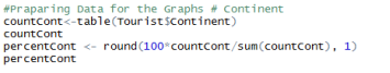
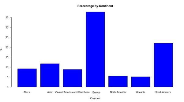
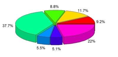
After visualizing where the tourists go it is important to know where they come from. For that reason, some graphs were also generated:
Graphic:

The same parameters were used to generate some other graphics:
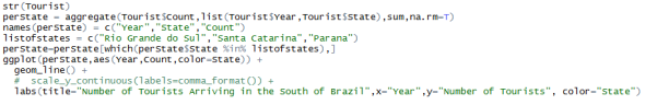
After analysing isolated information, a graph relating year and states was generated:
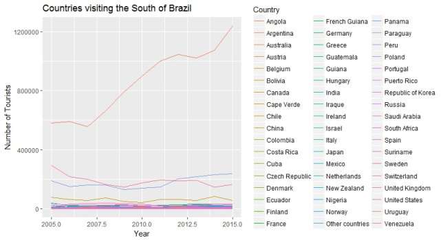
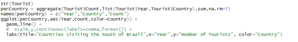
It was also generated a graphic listing all countries that visited the South of Brazil in the period:
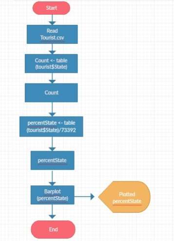
A flowchart was designed to represent the algorithm workflow process: Preparing data for a plot:
1.5 Evaluation
Compiling the dataset into graphics and tables facilitated data visualization and brought some very important evidence that can be used for many purposes, specially marketing reasons, on defining an action plan based on what can be done to bring more tourists to the south region.
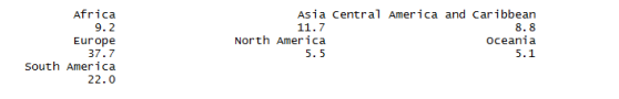
The graphs showing the percentages of tourists, were the ones that caught the attention, Europe had the larger number of visitors with 37,7%, followed by South America with 22%, Asia with 11,7%, Africa with 9,2%, Central America and Caribbean with 8,8%, North America with 5,5% and at last Oceania with 5,1%.
Looking at these proportions a few questions were raised and research was necessary. Some important facts showed up: the dataset brings only the number of people travelling for leisure purposes, it does not count the amount of people on business, with could impact on the numbers, especially from North America, as many of them visit the country for business purposes and extend their stay on holidays. Another very important factor is that the information was collected in the first stop in the country, and all the three states in the South do not have a large airport, usually they arrive by connection flights coming from São Paulo or Rio de Janeiro, where the main international airports are situated. The last very important element that could impact on the number of visitors, is the fact that the south of Brazil does not have a tight control of their borders and many people arrive by land, usually driving from other countries in South America.
As said before the tourism sector can be very explored and it can impact in the revenue generation. According to the International Congress & Convention Association (ICCA) Brazil is the host of many international events in Latin America and the seventh in the world, so why not leverage on the information brought and attract all those events to the South of Brazil?
The numbers in the dataset look a bit too similar for every year related to the count of people visiting the states, but anyway it provides very useful information. It is also very important to observe that Brazil is also accessed by boat and land, specially by tourists coming from Central and South America, as there is no border control some of the numbers might be slightly different.
The project scope is limited to identifying patterns in the data rather than predicting future which could be examined as part of further study of the subject matter.
2.1 Business Understanding
Every time a famous person passes away the media makes news; some deaths even take the elements of scandals, especially when there is the suspect of a suicide, people follow the reports all over the world.
The year of 2016 seemed to be very sad for the famous people, with an unusual number of deaths observed. An article from the 22nd of April, 2016 on BBC News website reported that by April the number of celebrities’ deaths was double as the previous years, and even said: “the number of significant deaths this year has been phenomenal.” But comparing to the years before, is it true?
Based on a dataset available on kaggle.com, that compiled information available on wikipedia.org, some questions were asked:
– Did more celebrities die in 2016 than in the last 5 years?
– Was suicide the most cause of deaths?
– What were the reasons for the deaths in 2016?
– Were the reasons different from the 5 years before?
– What would be the main causes of death for each age group?
2.2 Data Understanding
Source data: https://www.kaggle.com/hugodarwood/celebrity-deaths
Format: csv, comma-separated
Size: 1.47 MB
Number of rows: 14.880
Columns:
Â
1 age
2 birth_year
3 cause_of_death
4 death_month
5 death_year
6 famous_for
7 name
8 nationality
Â
The technologies used were Excel and Python 3.6
2.3 Data Preparation
The original downloaded version had 21.562 rows, with a quick look through the data, a few abnormalities were shown, a number of duplicated cells and rows was observed, also some birth_year did not correspond to real birth year, there were also some animals among humans (specially racehorses and dogs). Excel was used to exclude the duplicated data, to clear some odd information and to exclude the deaths from 2006 to 2010, as the project idea was analyse only the past five years.
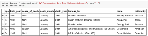
The first step was reading the table through pandas:
Looking at the classes and missing values:
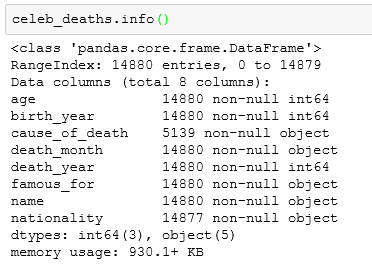
As it is clear there are many missing values of cause of death.
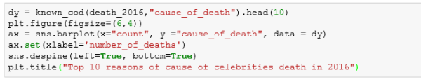
Looking at the most common causes of death:
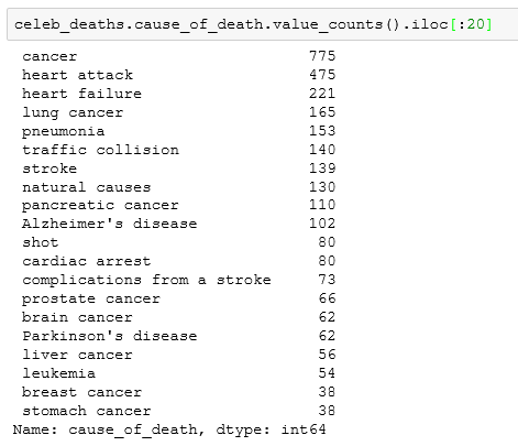
* It seems like many celebrities tend to die from cancer and heart failure.
2.4 Modelling
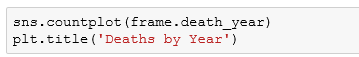 A bar plot was generated for better visualization:
The article from BBC was not entirely wrong, in 2016 more famous people died, compared to the 5 previous years.
Looking for the answer for the second question, a bar plot about the suicide rates was generated, was suicide the main cause of deaths?
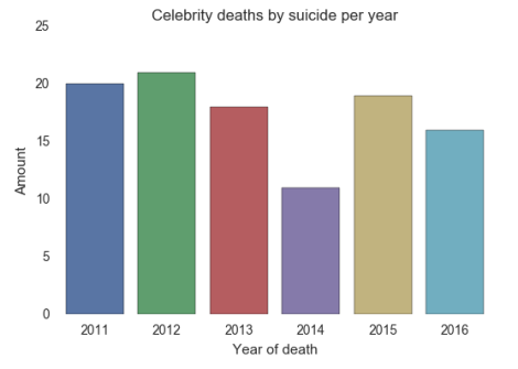
It cannot be said that suicide was the main reason for the deaths.
As seen on the previous graphic there is a percentage of celebrities that commit suicide, but comparing 2016 to the five previous years and comparing with natural deaths, a new bar plot was created:
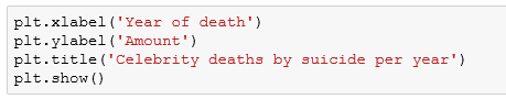
Compared to the previous years, 2016 did not seem as bad as the papers and social media claim, as the suicidal rate was only higher than 2014, in this way it cannot be affirmed that the main cause of celebrities’ deaths in 2016 was self-murder.
Just for information a graphic was created to illustrate which is the month when more famous people tend to take their lives:
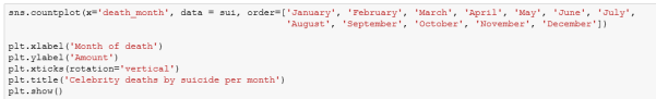
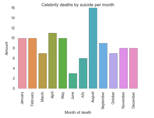
As the bar plot displays September is the month showing a highest level of suicide, while June appears as the lowest.
The figures generated from the data set brought a few information so far, proving that 2016 was a sad year for famous people, it also showed that suicide was not the main cause of death. To find out what the main reasons were a bar plot was created:
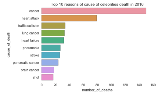
Appears that cancer killed more famous people, at least in the year of 2016.
Still comparing 2016 to the five years before an average number of deaths by cause was called, to investigate:
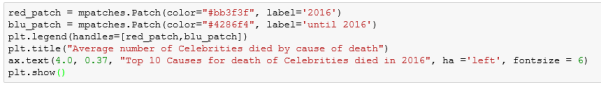
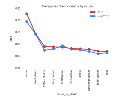
The comparison shows that compared to the five years before more famous people died due to more Cancer and Traffic collision, all the other reasons seem to follow the same pattern.
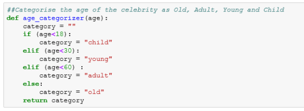
Just out of curiosity and to have a better understanding from the facts, the dataset was categorized into age groups:
Some pie charts were created to illustrate the cause of death by age group:
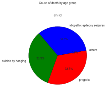
It is very important to bring to attention that in the child group there were only five rows and that is why the percentages are very high.
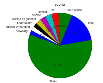
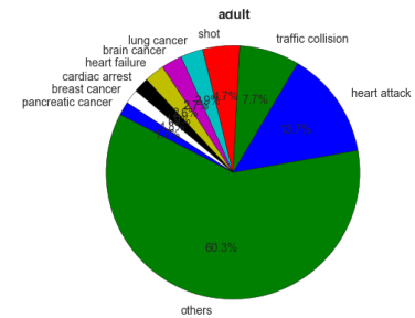
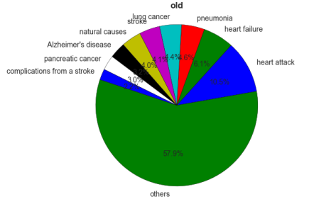
It is very challenging trying to analyse the deaths related to the age group as there were many missing data specially when it comes to cause of death. As a matter of fact, as common sense, the older people get the age-related diseases appear more in the graphics.
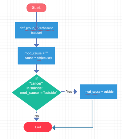
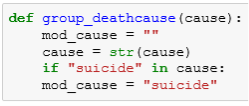
A flowchart was designed to represent the algorithm workflow process: In cause_of_death column = suicide
2.5 Evaluation
Compiling the dataset into graphics and tables facilitated data visualization and brought some very important information about the celebrity death from 2011 to 2016. The missing values made the difference when trying to get deep information, especially when it comes to cause of death.
It was pretty obvious from the data that 2011 the number of dead famous per year increased slightly, however not all the celebrities in the list would actually be considered as such by many people. It was cleared that the suicidal rates are not as high as the media claims and it is not the main cause of death and
The increase in the number of news about famous people’s death can also be happening because more people have access to the internet, social media and seem to talk more about it.
It is important to remember that the project scope was limited to identifying patterns in the data rather than predicting future.
I could not say it was an easy task choosing and analysing two datasets. As I am not a student with any IT background some of my ideas as an “outsider” were completely mistaken, as I did not know how difficult it can be to write codes and get information from the datasets. It took me a while to understand the basics of how the Python an R work, and I consider I have done a good work.
I can tell that I went through an incredible learning journey since I started the Data Analytics course at National College and I have learned a huge volume of new skills. To get the present project done I watched uncountable number of videos, I tried many different environments until I felt comfortable to start the project itself, it also took me a while to find the right dataset and the right “questions”, but after seeing the graphics and tables I realised I could really get through and do a good project.
As our course dedicated more time to Python and have always reading about R as a very difficult data analytics tool I confess I was terrified about it, that is why I decided to start the R Project first, but I had a very good surprise, the program is easier to use than I thought, even with my very little knowledge. Working with a dataset that I am familiar with made it simpler as well, I have always worked in marketing environments and had the curiosity to know more about tourism in the South of Brazil, where I was raised. I consider I found out important information, that maybe could be very valuable for companies investing in services and tourism.
For the Python project, I decided to work with the celebrity-deaths dataset just out of curiosity, as almost every single day during the year of 2016 I saw on twitter the “#celebritydeaths2016”. But after analysing the dataset I found out that there is only a slightly evidence that more famous people died during the year of 2016 it cannot be said that it was the worse year or predict anything for the future. I have also found out that suicide is not the main reason for their deaths as the social media reports.
The idea of both projects was to identify and extract patterns in the data, which I believe has happened.
Big Data: 20 Mind-Boggling Facts Everyone Must Read. Available at: . [Accessed: 10 December 2016].
Business Dictionary. Available at: . [Accessed: 09 December 2016].
EstatÃsticas e Indicadores. Available at:  [Accessed: 09 December 2016].
Lantz B., 2013, Machine Learning with R, Packt Publishing IBM, 2011, IBM SPSS Modeler CRISP-DM Guide, IBM Corporation. Available at: [Accessed: 11 December 2016].
Ministério do Turismo. Available at: [Accessed: 19 December 2016].
Skill: Data Analysis. Available at: [Accessed: 09 December 2016].
Why so many celebrities have died in 2016? Available at: [Accessed: 26 December 2016].
Source data:
Source data: https://www.kaggle.com/hugodarwood/celebrity-deaths