Recommendations for Hotel and Flyer Marketing

The Ashford Court Hotel
Ennis
Customer Service As the saying goes “You only get one chance to make a first impression”
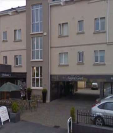
Message – Negative Even though it has recently been painted, the overall appearance is still fairly run-down. It does not portray a good welcoming ambiance for anyone visiting the establishment and there is rust on the sign leading to the car park which is unappealing. The outdoor furniture could do with upgrading and because the hotel had been closed for a number of years, there is an unpleasant damp odour at reception which is very off-putting for prospective guests. Furthermore, the location of the hotel leads into the back entrance of some business which is unsightly and unwelcoming.
RecommendationsFirst impressions are extremely important in the hospitality industry. Visiting or prospective guests are influenced by the façade of the hotel. To improve its appearance, I would replace the faded sign as it portrays a blasé approach by the owners/managers. The addition of colourful flower pots would be a simple but effective improvement. Replacing broken or faded outdoor furniture would also be a big improvement.
 The Old Ground Hotel
Ennis
Customer Service
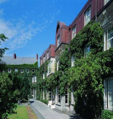
Message – PositiveThe first impression given of the exterior of Old Ground Hotel is very impressive. It exudes warmth and welcome which is principally what’s required in the hospitality industry. The hotel is situated in the heart of Ennis town adjacent to shops, restaurants and bars. The outside of the hotel is maintained to the highest standard and so are the grounds which are beautifully kept with various flowers and trees. It is also adorned with modern outdoor furniture which facilitates al fresco dining and refreshments weather permitting. The hotel conveys an old world charm even from the exterior which is very appealing. There is ample parking within the hotel grounds which is very convenient for the guest. The overall impression is positive, welcoming and very well-organized.
 Glor.ie
Positive Impression
Website:This website is impressive and professional looking at first glance which will have a positive influence on the user when visiting the site for the first time. The layout is very clear and the colour scheme is subtle and easy on the eye which creates balance and harmony. The website is clearly laid out and easily navigated which means the visitor can easily find what they are looking for which is, after all, the purpose of a good website.
The website has an inviting and warm appearance which should influence the user and encourage repeat visits which is good for business. Performances can be booked and seats picked with ease. The site is also mobile friendly with good clear print. This is important as it is now commonplace to access websites from mobile devices, particularly amongst younger people.
Powercity.ie

Negative Impression
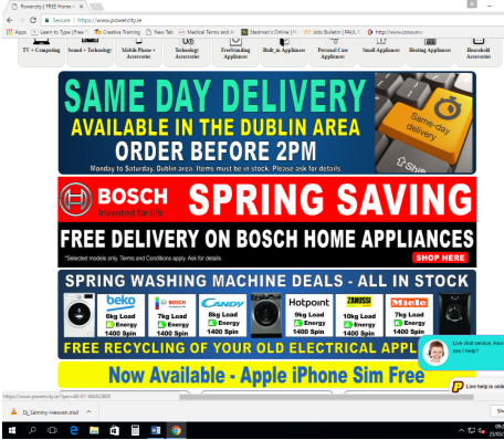
WebsiteThe impression given by this website is not good. There are too many colours going on which clash with each other and it creates a flashy and cheap appearance. It doesn’t inspire confidence as it sells electrical appliances which are quite expensive commodities and it looks more like it’s advertising a cut-rate discount store. It’s important to make good decisions with colour that will be soft on the viewers eyes, or that will ensure clean and clear visibility of text. If the website viewers are straining because of the colour choice, it constitutes bad design which may irritate a prospective customer and discourage them from buy or re-visiting the site and this is bad for business. More and more business is being conducted online than ever before and so it cannot be emphasised enough how important a website is for showcasing a company and it’s products.
RecommendationsGood colour choices can have a major influence how a visitor interprets what they see as much as layout and print. A neutral colour scheme with a subtle dash of colour can create a classy and elegant feel. A minimal colour scheme can still produce contrast and give a unique, impactful visual impression thereby creating a more professional appearance. If the visitor is at ease and can read and navigate the website easily, they are more likely to return to the site or even make a purchase.
Treacys West County
Hotel Flyer
Positive Impression
See Appendix 1Flyers are an effective way to promote a company. Most hotels have flyers available at reception and these contribute in no small way to the advertising of the business. Treacys West County’s flyers are clear concise and effective in portraying a positive and efficient image of the hotel.
The flyer is tastefully photographed with warm and inviting pictures of the hotel and its facilities. It keeps colour to a minimum and uses soft photographic lighting which helps to create the appearance of a warm ambience thus enticing the prospective guest.
The written word in the flyer is kept to a minimum letting the pictures do most of the advertising. The use of the word ‘you’ indicates they are speaking directly to the reader, not abstractly to some unknown ‘they’ which is an effective way of enticing the prospective guest.
Flyer
Ciarán Mulholland
May 2014 Northern
Ireland Council
Elections
See Appendix 2
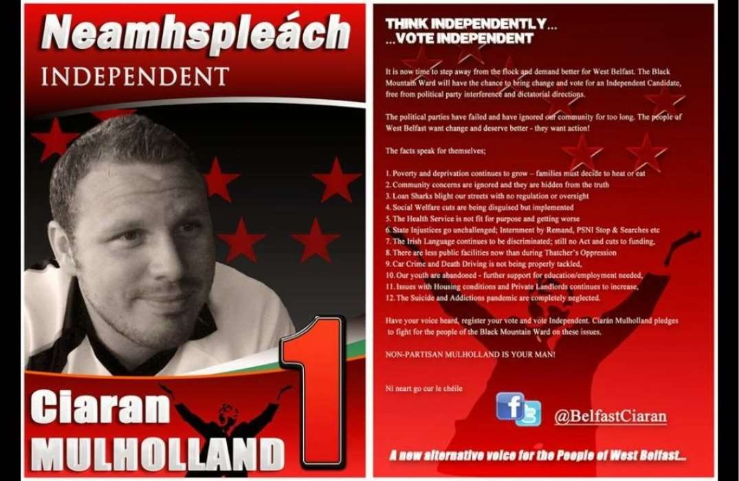
Negative ImpressionWhen running for election, flyers can have a considerable impact on voters especially those who have not yet decided which candidate they are voting for. The attached political flyer is an assault on the eyes! Firstly, the red and white colours do not work effectively together and make it very difficult to read the content which is, after all, the purpose of the flyer. It looks like a hurried job as if there wasn’t enough thought or time put into it and therefore looks rushed and unprofessional. Also, there are no contact details on the flyer and this is a very important detail, particularly in politics. Citizens need to feel that their representatives are contactable and available to them. A candidate running for public office needs to portray an efficient and professional image which this flyer certainly does not do.
Recommendations:Firstly, the colour scheme should be changed to more subtle tones which are easier on the eye and easier to read. The content of the flyer should be given careful consideration, straightforward and to the point and should definitely contain the contact details for the candidate.
A well-designed flyer will catch the readers’ attention and will therefore serve its purpose and could even be the difference between getting elected or not!
News report regarding employment conditions in Dell EMC.
See Appendix 3
Positive Impression.Technology company Dell EMC who have sites in Limerick, Cork and Dublin, was voted the “Best Place to work in the Private Sector in Ireland”. This accolade was voted for by the employees of the company. They provide competitive salaries, a fun and open environment and flexible working hours which accommodates a better work-life balance.
They prioritise the welfare of their workforce which has obviously paid off hugely resulting in a happy and productive workforce. This benefits both the business and employees alike. They also encourage workers to use their skills and abilities which is of benefit to everyone. It is well known that job satisfaction leads to increased productivity and fosters loyalty and dedication to the company.
 News report regarding employment conditions in Dunnes StoresÂÂ
See Appendix 4
Negative Impression:Dunnes Stores are continuously in the news when it comes to employee relations which the attached article will attest to. The main issue in this article refers to zero hour contracts. It is very difficult for anyone to have any quality of life under these circumstances. It is impossible to make any kind of financial plan e.g. loan repayment when the employee has no certainty from week to week what their earnings will be.
It would appear that employee welfare does not take any precedence with Dunnes Stores management. Profit seems to be the main objective of the company which is to be expected in a commercial business but not to the detriment of its employees. The fact that the turnover of employees in Dunnes Stores is high is an indication that all is not well when it comes to the working conditions of its employees and a contented workforce usually leads to increases productivity.
Recommendations:Dunnes Stores could do with re-evaluating how it treats its employees and this could only be achieved by the very top management recognising the value of their employees. Workers need to be appreciated and valued in order to achieve job satisfaction and a happy workforce more often than not leads to improved productivity which would benefit management, staff and customers alike. The company and their employees would benefit by having clear structured contracts of employment for everyone which would provide some stability for their workers.
Â
